6 Steps to Build a Solid Banner Component in Drupal 10
We’re well familiar with the saying that “You never get a second chance to make a first impression.” Nowhere is that more true than on a web page. Banner images are an essential element in effectively conveying the brand and the culture within a framework for design flexibility. There’s a lot riding on getting it right.
The question is: what makes a banner work, and how do we build it properly so that it is reusable, responsive, configurable, aesthetically appealing, and useful?
In this post, I’m going to provide a step-by-step guide concerning Promet’s process for creating a rock-solid banner component that meets all of the above criteria and more.
We're going to be building this banner component as a block, and it will be used within Layout Builder. Among the reasons for doing so is an increased emphasis within the Drupal community on Layout Builder. Layout Builder is also built into Promet’s Provus® platform.
Banner Component Must-Haves
There are four factors to keep in mind when developing a banner component.
- Flexibility. A banner should have the flexibility to contain different types of content or images. It should be able to provide options for design considerations such as, background colors, size, and location of images.This flexibility will allow the banner component to be re-used across different mediums on the site, without needing to repeat design elements or content.
- Ease of use. A banner component needs to be easily accessed for nearly any landing or high-level page on a site. As such, it should be a single component, with easy-to-understand options/controls, and it should be able to be created efficiently.
- Responsive. Mobile responsiveness is an absolute requirement. This requires the set-up different image styles for different breakpoints, as well as considerations concerning font sizes on mobile vs. desktop, and stacking content on mobile vs. columns on desktop.
- Look and feel. Design is critical to a successful banner. In order for a banner to be useful, it needs to be brand aligned and “clean.” Also essential is the assurance that text, contrast ratios and other factors are in compliance with accessibility guidelines.
6 Steps
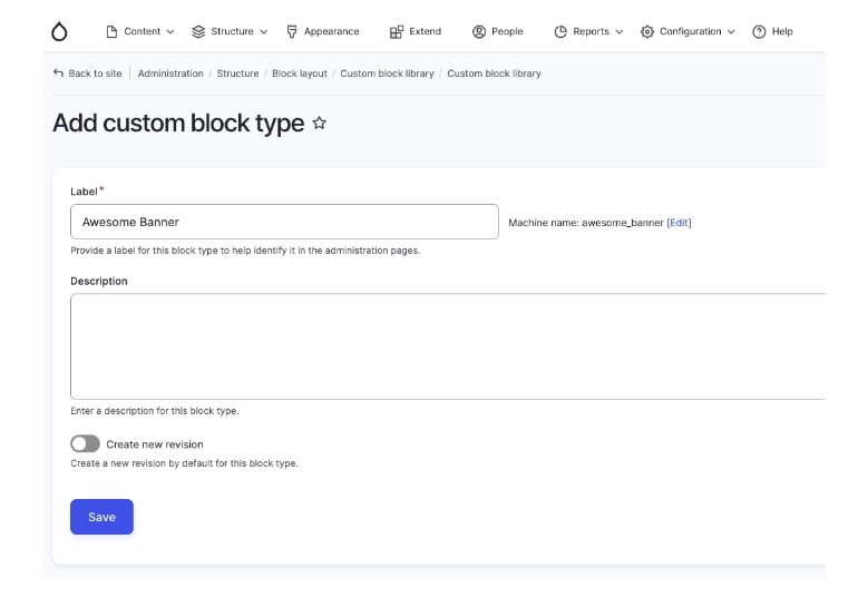
1. Create your block type.
2. Create your fields.
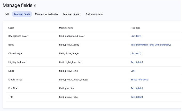
- Title
- Body text
- Button (with options for different styles)
- Image upload
- Image location
- Background color (Include primary, secondary, and tertiary colors used in theme)
- Size and width
3. Create responsive image styles (Landscape on Desktop, Portrait on Mobile).
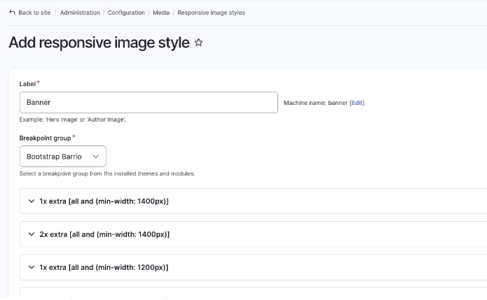
If you're not familiar with how to create a responsive image in Drupal, this article on setting responsive image styles offers step-by-step instructions.
4. Create a Twig file with the flexibility to have different options.
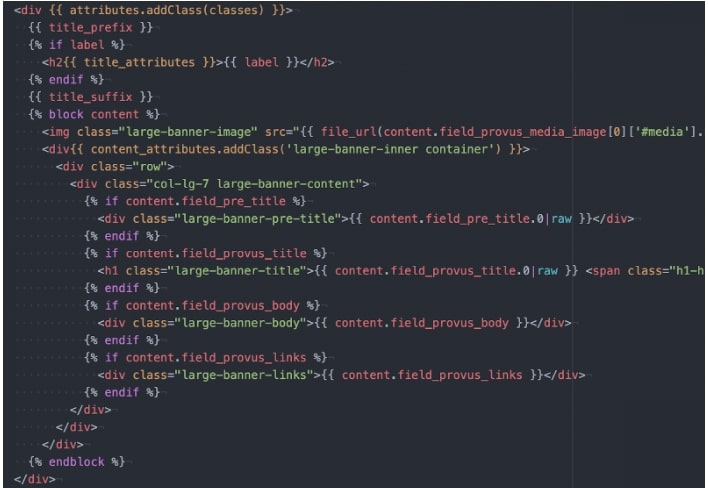
5. Create an SCSS to theme your component accordingly.
The term SCSS is an acronym for Sassy Cascading Style Sheets, a more advanced and variant of the CSS language.
6. Put all steps together and into practice.


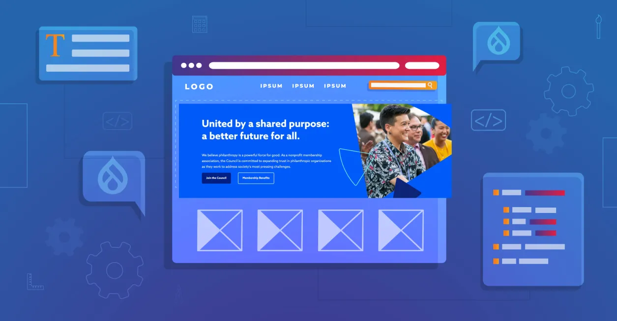
Banner components from three websites recently designed by Promet Source: Oncology Nursing Certification Corporation (oncc.org), the Council on Foundations (cof.org), and the Frank Lloyd Wright Trust (flwright.org).
Promet’s open-source Provus® distribution has proven to be an essential platform for efficiently developing flexible, easy to use, responsive, well designed banner components. Interested in learning more or seeing a demo of Provus® in action? Request your free demo today.
Other Insights & Resources you may like


Get our newsletter
Get weekly Drupal and AI technology advancement news, pro tips, ideas, insights, and more.