Table of Contents
Note: This blog was first published on December 15, 2021, and has been updated to reflect new information and insights.
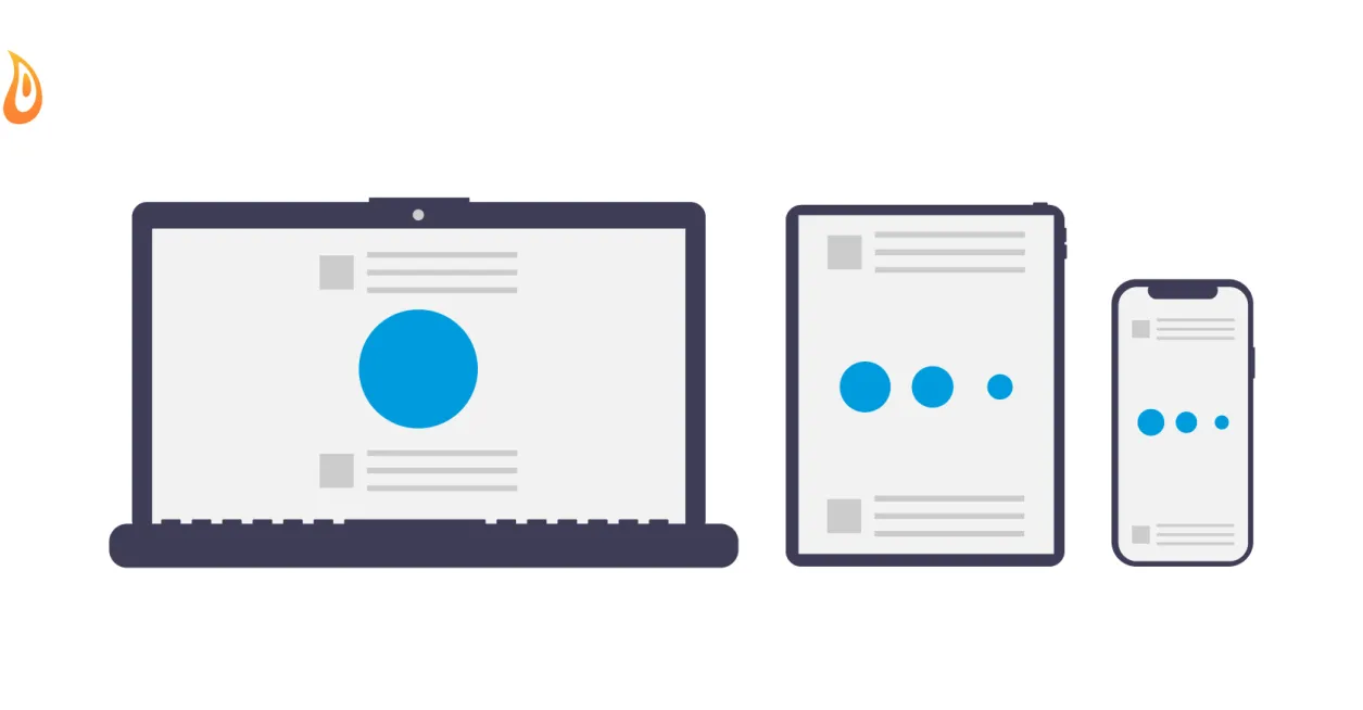
Takeaway: Optimal user experience is an essential aspect of web development, and the key to that is the assurance of correctly sized images. If your visitors are using a mobile device, the use of large images that are suitable instead for desktop viewing is not optimal.
Ensuring the right-sized image for the right device is what's referred to as "responsive images."
Responsive image styles are standard practice for us, and they greatly benefit website performance and user experience. So, it's a no-brainer to include them in any website build.
Responsive images speed up loading times, save bandwidth, and give visitors a better experience overall. This post will focus on setting responsive images in Drupal 10.
If you need to set responsive images for Drupal 7 (and of course, we’re hoping you are already planning your migration from Drupal 7 to Drupal 10), you can check our blog Picture Module: Building Responsive Images in Drupal 7.
For Drupal 10, the key steps that need to be executed are as follows:
- Install the Responsive Image module (using Composer or Drupal UI).
- Set up the breakpoints.
- Create image styles.
- Set up the responsive image.
- Assign the responsive image style to the image field.
- Export configurations to code.

GO FROM DRUPAL ZERO TO HERO WITH OUR TRAINING EXPERTS
Step 1: Install the Responsive Image module
As was also the case with Drupal 8 and 9, the Responsive Image module is part of Drupal core. For this reason, additional modules do not need to be added in Drupal 10.
The Responsive Image module provides an image formatter and breakpoint mappings to output responsive images using the HTML5 picture tag. This allows devices to display larger or smaller images based on the screen size.
Steps via Composer
- Open up your command line tool (we like to use iTerm with oh-my-ZSH).
- Travel to your site directory using cd.
- Run the command: drush en responsive image.
Steps via Drupal UI
- Once logged in as admin, go to Extend in the Drupal admin menu, or visit the URL path: /admin/modules.
- Then, in the list of modules, scroll down until you find “Responsive Image” and click the checkbox next to it. Helpful tip: you can also search for the module name in the search box at the top.
- Click on “Install” at the very bottom of the list.
Step 2: Set up the breakpoints
This is where we decide our breakpoints. How many will we have? At what size will we show a different-sized image? Some default themes already have the breakpoints.yml file. It might be worth checking for that in your theme first.
If you have a custom theme, go to your editor of choice. We like to use Sublime Text, Atom, or Visual Studio code.
In Drupal 10, the root of your theme directory will be located at /themes/my_theme_name or /themes/custom/my_theme_name, depending on your setup. In the root of your theme directory:
- Create a file called my_theme_name.breakpoints.yml
- Replace my_theme_name with the real name of your theme
For this tutorial, I will call my theme "myd10demo."
Below you will find an example of a breakpoint setup for this theme. We’re setting up three breakpoints. One we would use for mobile phones, one for tablets, and one for desktops.
But this is just an example, please choose a breakpoint that works best for your website, and your theme, as you may already have a grid system with breakpoints configured in your CSS.
myd10demo.small:
  label: small
  mediaQuery: ''
  weight: 0
  multipliers:
    - 1x
    - 2x
myd10demo.medium:
  label: medium
  mediaQuery: 'all and (min-width: 768px)'
  weight: 2
  multipliers:
    - 1x
    - 2x
myd10demo.large:
  label: large
  mediaQuery: 'all and (min-width: 1200px)'
  weight: 2
  multipliers:
    - 1x
    - 2x
Each breakpoint will tell Drupal what image size to load for each assigned mediaQuery.
For example, we can load an image for mobile devices using a smaller image style for the breakpoint at min-width: 0px. When the browser is at min-width: 768px we can load our "tablet" image style, and at min-width: 1200px, we can load our desktop or full size images.
It is important to note that the breakpoints weight should be listed from smallest mediaQuery to largest mediaQuery. This allows you to follow a mobile-first approach, as your Grid system (if you have one) is likely following a mobile-first approach as well.
The multipliers attribute allows us to display a crisper image for HD and retina display. A great example of that would be to have an image style of 1000x1000 for a normal screen, but on a retina-ready screen, you might load an image at 2000x2000.
Step 3: Create your image styles
Now we need to create the image sizes for the different breakpoints and different resolution sizes. To do that, in the header:
- Go to Configuration> Media > Image Styles or go to /admin/config/media/image-styles.
Next, you'll need to create an image style for the breakpoint and resolution sizes you set up in your my_theme_name.breakpoints.yml.
We created three breakpoints in our breakpoint.yml file. We are setting up two resolution sizes for retina and non-retina screens. So, we will have six image styles. You could label them as follows:
- Mobile 1X
- Mobile 2X
- Tablet 1X
- Tablet 2X
- Desktop 1X
- Desktop 2X
To start creating your image styles, follow these steps.
- Click the "Add image style" button in the top left corner.
- Type in the name of your image style. It’s better if your image style name is descriptive. You will likely be setting up several image styles throughout your project.
- Click “Create new style.”
- When you’re redirected to your new image style, using the dropdown under “Effect,” choose scale and crop. Another helpful tip: For even better transparency and cropping capabilities, try adding the “Focal Point” Module. It will allow you to select which area/direction your image would scale and crop.
- Click the “Add” button.
- Enter the size of your image style. As an example, our mobile image might be 400x200, and our retina-ready mobile image would be 800x400.
- Click "Save."
- Repeat steps 1-7 until you’ve created all six image styles.
For each image style, we have used the scale and crop effect to resize and crop the images uploaded automatically.
Step 4: Set up the responsive image styles
Now we will assign the image styles to the breakpoints.
- Go to Administration > Configuration > Media or go to /admin/config/media/responsive-image-style.
- Click on "Add responsive image style."
- For this tutorial, I will call it "Article Image" since this will be used for the main image in our article content type.
- Select the theme we created earlier (myd10demo).
- Select the correct image styles for each breakpoint.
The Drupal UI will display the breakpoints from largest to the smallest.
- For our retina-ready desktop image, open up the dropdown called "Large 2X."
- Select the image style "Desktop 2X."
- For our non-retina Desktop, select "Desktop 1X."
So on and so forth until you’ve selected the correct image style for each breakpoint and screen resolution.
At the end of the form, you will find the "Fallback" option. This will be used in case the responsive images are not available.
- Select the smallest image style you created here, the same as for mobile.
- Select the smallest responsive image style effect you created in the "Fallback" option.
Step 5: Assign the responsive image style to the image field
Let's recap. So far we’ve set breakpoints and resolution sizes in our theme to be used for our images. We then created six image styles, one for each screen size and resolution. Then we connected the created image styles to our created breakpoints.
Now it's time to attach the responsive image style to one of our image fields. This way, when an image is printed using the "display" of a content type, it will be printed using this responsive image style.
- Go to Administration > Structure or go to /admin/structure/type in your address bar.
- On the content type you want to change (in this example, the article), click on the arrow next to "Manage fields" and select "Manage Display."
- On the Manage Display form, on your image field, click on the dropdown under the "Format" for your image and select the "Responsive image" option.
- After that, click the gear icon located on the far right-hand side, and select your responsive image style ("Article image" in our example).
- Click save and we are almost done!
To check:
- Add a new content piece and add an image to the image field (make sure you are in the right content type).
- Resize your browser to view the page like a tablet or a mobile device.
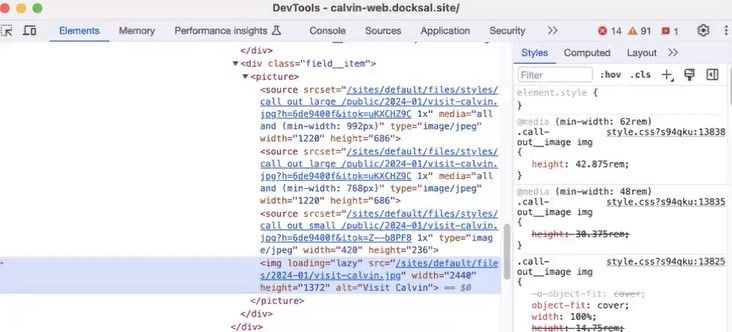
- Right-click on the image and click "Inspect."
You should see an HTML5 <picture> attribute with many different image styles within breakpoints.
Step 6: Export your configurations to code
The very last step is to export all of these Drupal configurations into code. We do this for several reasons, two of which are:
- To ensure our settings are saved and can be imported to your sites in the future while allowing you to overwrite configuration if they are modified in the future.
- To allow us to commit something to git, leaving us a nice trail/breadcrumb of our work.
There are two ways of doing this. Either through the UI and exporting all configs, or through your command line using Drush (this is the recommended way if you have a server running Drush).
Below are the steps for both.
Via command line with Drush
- Use your command line tool cd into your website's root directory.
- Then run the following command: drush cex. If you’re running your site locally, you might be using something like Docker and docksal. In this case, you would run fin drush cex.
- Once this is run, you will get a list of modified configurations and files that will be overwritten in your /config/default directory.
- Press the enter key to accept.
Via UI
- Go to Configuration > Development > Configuration Synchronization > Export or go to the path admin/config/development/configuration/full/export.
- Click the export button.
- This will export the entire configuration folder into a zip.
- Push your code up to whatever git repository you use, and celebrate your achievement.
Frequently asked questions
Why is a mobile-first approach essential in modern web development? How do responsive images fit into this idea?
A mobile-first approach is pretty standard across our industry. It allows for:
- Faster mobile load times
- Mobile-viewing optimized content and images
Responsive design fits into it by following suit with the mobile-first approach. When you create responsive images, it sets breakpoints and loads different image sizes at these points.
You can also set fallbacks. For example, having mobile as the default ensures that smaller images are loaded instead of large files that may slow down loading times.
What is the difference between implementing responsive images in Drupal 9 vs Drupal 10?
There is no difference. Setting Drupal responsive images is consistent across versions 8, 9, and 10.
Is there a difference in how we set responsive image styles in Drupal versus other CMSs?
There is a difference. Drupal makes it easy because it's essentially built-in.
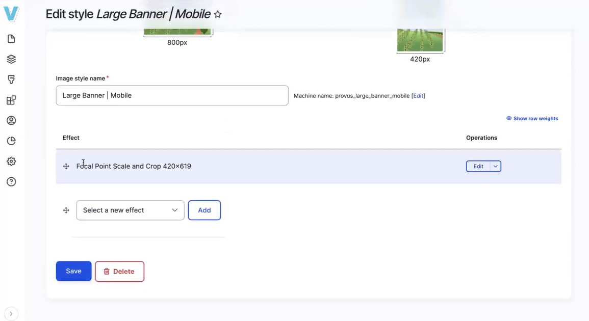
With Drupal, you start by creating image styles. For example, let's take a look at a large banner for both desktop and mobile. Each of these image styles is set with a focal point scaling crop, ensuring specific sizing while maintaining the center focal point. For instance, the mobile large banner might be set to 420x619 pixels.
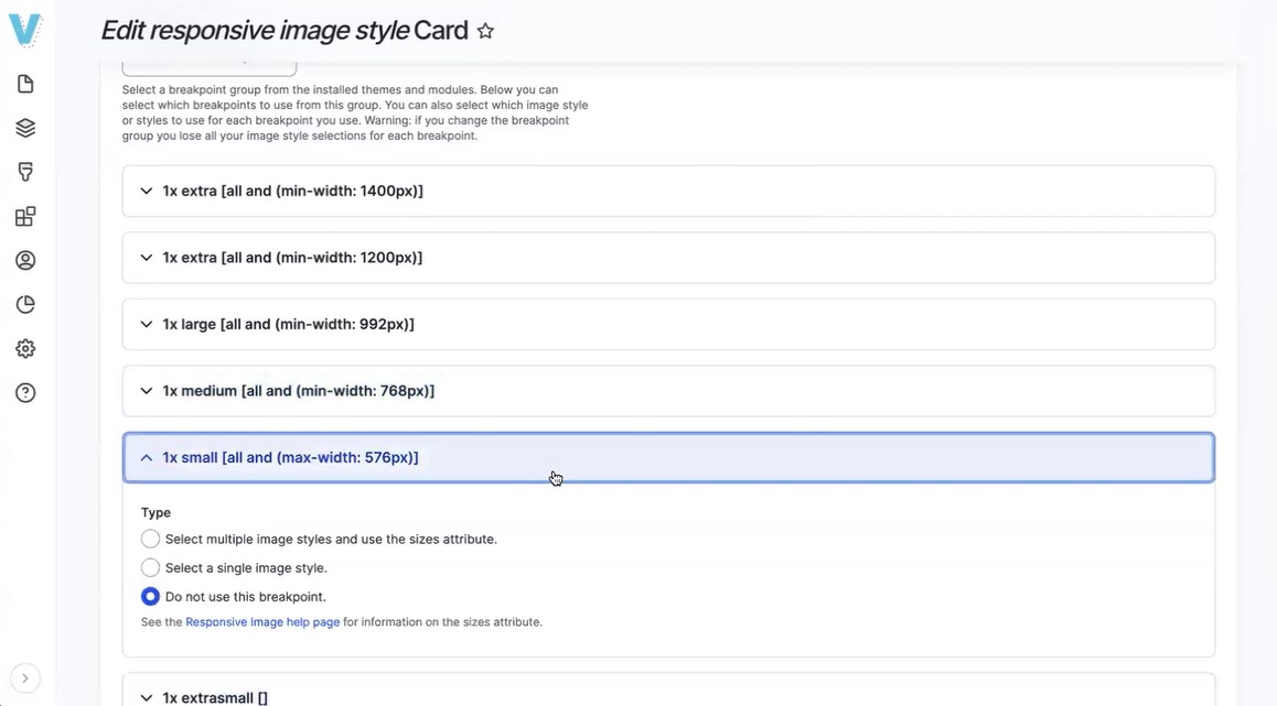
Then, we set up a responsive image style within our theme, aligning breakpoints with container sizes and content behavior. We can specify which image style to load based on the minimum width, ensuring that the appropriate image is displayed for different screen sizes.
This process is specific to Drupal. While other CMSs may offer similar functionalities, they often require additional coding or plugin installation to achieve the same level of ease.
How else can setting responsive image styles in Drupal be easier?
Provus® is our Drupal component-based platform. In Provus®, we have enabled the focal point by default. This usually isn't enabled. However, our clients request it because it ensures that important elements of the image, like faces, remain centered during scaling and cropping for mobile viewing.
SEE HOW THIS WORKS WITH PROVUS®—BOOK A FREE DEMO
How do responsive image styles in Drupal enhance site performance and user experience?
Responsive image styles ensure that appropriate image sizes are loaded, reducing loading times and improving performance. We also lazy-load images, meaning they're only loaded when they come into view, further enhancing user experience by reducing unnecessary asset loading.
Learn all about Drupal through our training classes
Our team here at Promet Source is devoted to channeling our collective brainpower toward helping the Drupal community take advantage of all that Drupal 10 has to offer. If you want to learn more about Drupal and optimize your skills, sign up for our training classes!

Our fearless leader, Andy Kucharski, has more than 15 years of technical and project management experience from startups to Fortune 50 firms with industry experience in banking, telecommunications, government, and association technology management. Andy’s ecommerce experience dates to 1998 with the implementation of highly scalable enterprise solutions for telecommunications providers.
Other Insights & Resources you may like


Get our newsletter
Get weekly Drupal and AI technology advancement news, pro tips, ideas, insights, and more.