Table of Contents
Note: This blog was first published on August 1, 2023, and has been updated to reflect new information and insights.
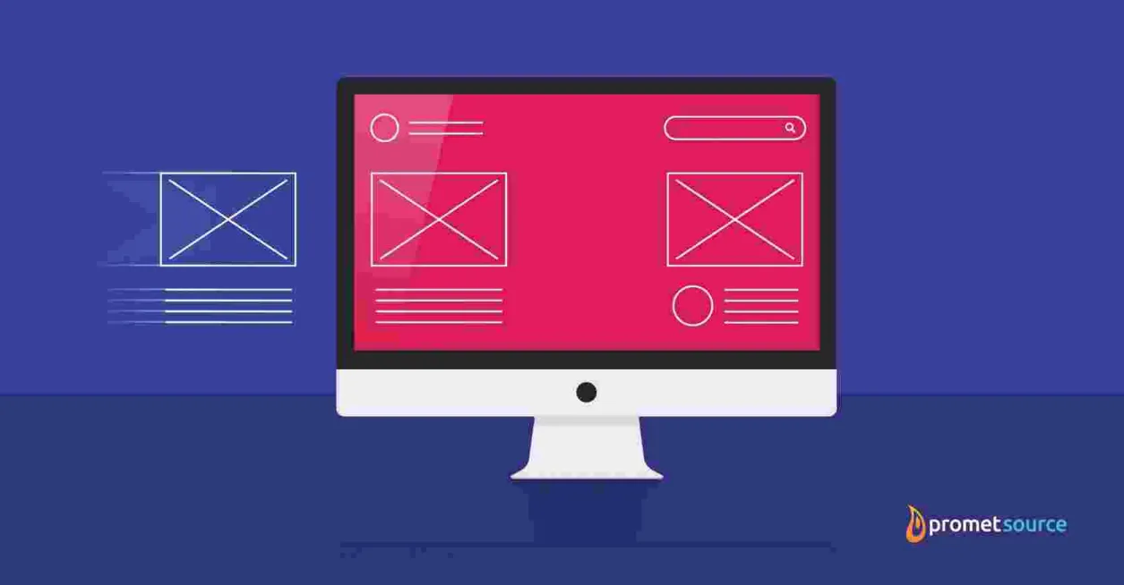
Takeaway: Component-based design is becoming the new normal for both web developers and site administrators. Its advantages run deep and wide, offering next-level, no-code empowerment for updating content, switching up layouts, adding functionality, and creating new pages.
This approach brings a myriad of advantages to the table. Here are our top 7.
- Streamlined Content Management: Enable non-technical editors to effortlessly create and update webpages.
- Enhanced Flexibility and Customization: Tailor websites to meet your brand guidelines while standing out from the crowd.
- Empowered Content Editors: Foster creativity and accountability among editors.
- Consistent User Experience: Deliver a seamless and smooth online journey for users.
- Improved Website Scalability: Accommodate future growth with design capabilities that allow websites to adapt over time.
- Ensured Website Accessibility: Comply with the latest standards and ensure your site is available for all to use.
- Effective Future-Proofing: Ensure when the digital landscape evolves your site can do the same.
EXPERIENCE THESE ADVANTAGES FOR YOURSELF
Imagine your website as a library, where each component of your site is like a book on a shelf or a piece of decor. Component-based web design allows you to organize, manage, and update these "books" and "decorations" easily, just like a well-managed library.
Let's explore how this analogy relates to the top 7 advantages of component-based web design.
1. Streamlined content management
In your website "library," streamlined content management is like easily rearranging books on a shelf. You can move components around, add new ones, or remove outdated ones without needing a developer's help, just like managing books without a librarian's assistance.
This means your content team can keep your website current and fresh without relying on your IT team, saving you time and money.
2. Enhanced flexibility and customization
As a library manager, you can customize your website library's look and feel to meet your brand guidelines and visitor preferences. Components are like furniture and decor in your library, allowing you to create a unique and appealing experience for your visitors.
Content editors, without any design or coding experience, can ensure every element aligns with brand preferences and overall aesthetic.
3. Empowered content editors
Your content editors are like assistant librarians, empowered to curate and manage the website library's collection. With component-based design, they can easily update and create content while maintaining consistency and brand guidelines due to system guardrails, just like assistant librarians following library policies.
Now the entire content team can experiment with different ideas and see what works best without worrying about breaking any set guidelines.
4. Consistent user experience
A well-organized library provides a consistent experience for visitors, making it easy to navigate and find what they need. Similarly, component-based design ensures a seamless user experience across your website, regardless of the page visitors land on.
This gives your website visitors a great user experience which will prolong their stay on your site and increase the likelihood they return in the future.
5. Improved website scalability
As your website library grows and evolves to meet the changing needs of your visitors, component-based design allows your site to scale and adapt easily. Just like a library expanding its collection or adding new sections, your website can accommodate growth without technical difficulties.
6. Ensured website accessibility
An accessible library provides features like ramps and wide doorways to accommodate all visitors. Similarly, component-based design helps ensure your website is accessible to everyone, regardless of their abilities, promoting inclusivity and compliance with accessibility standards.
We firmly believe that websites should be accessible, not just because it’s a legal requirement, but because it’s the right thing to do.
7. Effective future-proofing
Just as a library with a strong foundation and flexible design can adapt to future needs, component-based design future-proofs your website. By using the latest tools and technologies, your site can evolve alongside the changing digital landscape, remaining relevant and effective for your users.
Frequently asked questions
What is component-based web design?
Component-based web design involves breaking down web pages into reusable, pre-coded components or building blocks. This approach ensure maximum efficiency for content editors to create landing pages and content quickly and easily.
This approach:
- Includes elements such as text blocks, media galleries, and call-to-action buttons, which are stored in libraries for easy access by site administrators and content editors.
- Typically does not require coding expertise.
- Prioritizes simplicity and efficiency in website development and management.
- Benefits end users through a more consistent user experience, faster loading times, enhanced functionality, and more.
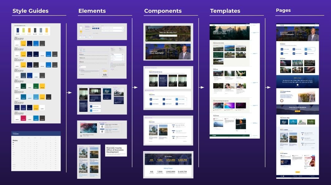
Your organization' style guide will provide direction for elements that will be further developed into customized components that will be used to make templates and pages that your content team can use.
This means your CMS can continue to grow and expand without issue as your team continues to innovate and implement new components.
Won’t component-based design lead to uniformity among websites?
Not at all! Despite commonalities among websites, one truth we’ve discovered at Promet after 20 years in business is that all websites are unique.
Site administrators and content editors can create new pages or revise layouts with customized components drawn upon a component library. As a result, your website visitors experience well-designed, consistently updated pages.
Component-based design systems improve efficiency, reduce duplication and inconsistency, and facilitate the development of quality, reusable components.
Clients using these systems benefit from better brand management resulting from a simplified content editor experience that allows for bending—but not breaking— brand guidelines or page structures.
What is an example of a component-based design system?
Promet’s open-source Provus® platform combines the latest drag-and-drop page building tools in Drupal with a curated library of design components, enabling content editors to easily layer designs, add functionality, and rearrange layouts.

Provus® showcases the advantages of component-based design by streamlining content management, enhancing flexibility and customization, and empowering content editors to create compelling web experiences efficiently.
More specifically, Provus®:
- Streamlines Content Management: Provus® empowers content editors with drag-and-drop functionality, allowing them to easily manage and update website content without developer intervention. This streamlines the content management process and reduces maintenance costs.
- Enhances Flexibility and Customization: With Provus®, websites can be customized to align with specific brand guidelines and user experience standards. Its curated library of design components ensures flexibility in layout and functionality, enabling unique and engaging web experiences.
- Empowers Content Editors: Provus® provides content editors with intuitive interfaces and self-adjusting features, ensuring ADA accessibility and readability.
- Design governance: Which offers the assurance that content editor empowerment does not translate into mismatched, crowded, or sub-par page designs. Its design governance maintains aesthetic consistency across the site, empowering content editors to create visually stunning pages while adhering to brand guidelines.
A differentiator between Provus® and other component-based design tools is the assurance that any combination of components within the library will be ADA accessible, adhere to brand standards, and look great.
What are examples of websites successfully using Provus®?
Orange County, California
Provus® played a significant role in the successful migration of Orange County's website to Drupal.
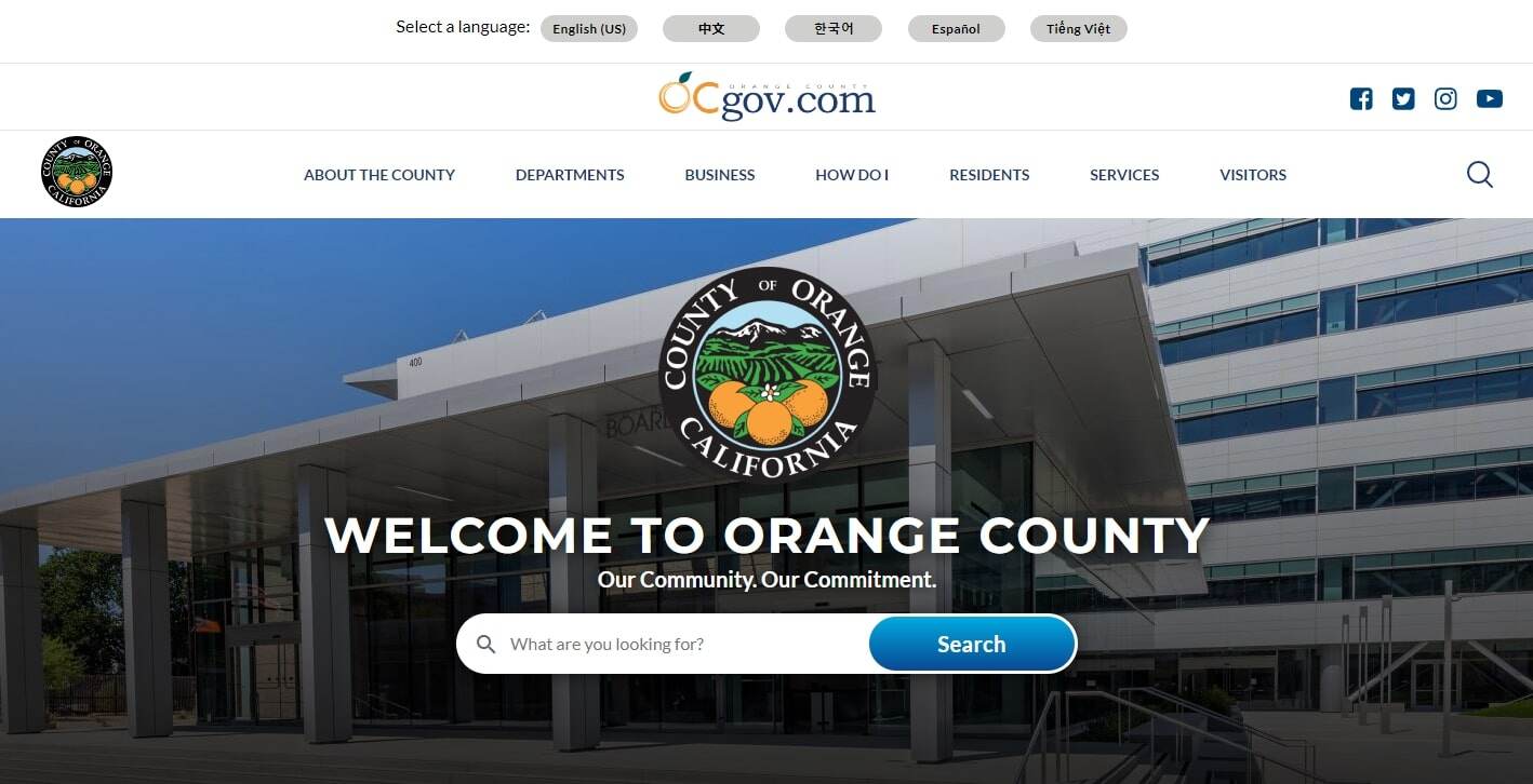
- Development Efficiency: Provus® drove a high degree of development efficiency, which was crucial given the tight migration timeframe of 18 months for migrating 41 distinct county sites into a cohesive whole.
- Empowered Content Editors: Provus® provided site owners and content editors with access to a robust library of content editing components, enabling them to manage the site without relying on technical expertise. This no-code, drag-and-drop content editing feature empowered a cadre of 100+ content editors to easily update the site, switch up layouts, and create new pages as needed.
- Consistency and Flexibility: While each of the 41 sites utilized the same code base, Provus® allowed every department's site to have a distinct database, with a cohesive design language and brand guidelines. This ensured a consistent user experience across the sites while still providing flexibility for each department.
- Layout Options: Leveraging Drupal Layout Builder and a carefully curated set of components, Provus® provided site owners with layout options based on sets of component blocks that could be mixed and matched for easy content editing.
Provus® streamlined the development process, empowered content editors, ensured consistency and flexibility across the sites, and provided easy layout options. These factors were essential to the success of the Orange County website migration project, given its scale and tight timeline.
Wasatch Front Waste & Recycling District
Provus® played a significant role in the successful redesign and migration of the Wasatch Front Waste & Recycling District's website from WordPress to Drupal 9.
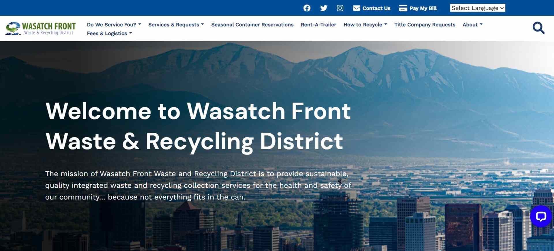
- Efficient Design and Development: Provus® proved to be a key factor in the efficient design and development of the new site. The component-based design system streamlined the process, allowing the team to focus on creating a modern, engaging user experience with aesthetically appealing visuals, consistent fonts, and improved search functionality.
- Empowered Content Editors: Provus®'s flexible component-based design system enables content editors to easily make updates and switch up layouts. This empowers the WFWRD team to manage and update the site's content efficiently, while ensuring adherence to brand and design guidelines.
- Improved User Experience: The new site provides a more modern and engaging user experience, with a content hierarchy that helps users efficiently find answers and information presented in a manner that makes sense to them.
By providing an efficient development process, empowering content editors, and contributing to an improved user experience, Provus® helped our team deliver a website that meets the needs of both our waste & water client and the Salt Lake County residents they serve.
Frank Lloyd Wright Trust
Using Provus®, the Frank Lloyd Wright Trust's website was successfully redesigned and migrated from Drupal 7 to a more modern and dynamic platform.

- No-code Updates and Revisions: The new site fully leverages Provus®, which provides a framework for no-code updates and revisions. This empowers the Trust's team to easily manage and update the site's content without relying on technical expertise, ensuring that the site can evolve alongside the organization's needs.
- Easy Creation of Landing Pages: Provus® enables the Trust's team to easily create landing pages that are close to pixel-perfect. This allows the organization to quickly develop new content and campaigns that align with their mission and engage their target audience.
- Streamlined Content Management: Due to Provus®, the site is easily managed by admins who can effortlessly add components such as accordions, FAQs, and share widgets. This streamlined content management ensures that the site remains up-to-date and relevant to visitors.
- Flexible Content Architecture: The content was incorporated into Layout Builder block types that integrated with Provus®. This flexible content architecture, enabled by Provus®, allows the Trust to present its content in a more engaging and user-friendly manner.
- Modern and Vibrant Design: The site's visuals, features, and functionality are now very modern and vibrant. Our Provus® component-based design system contributed to this improvement by providing a consistent, flexible, and visually appealing foundation for the site's design.
Provus® played a crucial role in the successful redesign and Drupal migration of the Frank Lloyd Wright Trust's website by providing a framework for no-code updates, easy creation of landing pages, streamlined content management, flexible content architecture, and a foundation for a modern and vibrant design.
These features empowered the Trust's team to manage and evolve the site efficiently, while delivering an engaging and informative experience to their visitors.
Experience these advantages for yourself
If this leaves you with questions like:
- How can we have a site that leverages component-based design?
- What type of budget do I need to implement a layout builder that empowers our content creators?
Contact us and hear from our award-winning UI/UX Director on how the team has helped so many organizations realize the advantages of a component-based design system!


At Promet Source, Cassey shapes marketing strategy and go-to-market execution, drawing on over 15 years of experience spanning marketing, business development, and digital transformation. Her background includes work across public, private, and nonprofit sectors, bringing a deep understanding of how to position services and scale impact across diverse industries.
Other Insights & Resources you may like


Get our newsletter
Get weekly Drupal and AI technology advancement news, pro tips, ideas, insights, and more.