5 Most Common Accessibility Errors on County Websites

Table of Contents
Takeaway: Throughout my career, I've reviewed hundreds of government websites for accessibility compliance. I often found issues that are easy to fix but create barriers for people with disabilities. I focus on the 13 biggest county websites for this post. The top 5 accessibility problems I found are:
- Poor color contrast between text and backgrounds
- Images missing descriptive alternative text
- Unnamed buttons
- Unlabeled form fields
- Duplicate IDs
The fact is, despite a widespread commitment to building engaging and inclusive web experiences, instances of accessibility breaks seem to inevitably emerge. These oversights creep in during site edits and obstruct access for vision-impaired and blind individuals who rely on assistive technologies.
To ensure county websites are inclusive of all citizens, I advise regular accessibility audits to catch and resolve such errors.
Web accessibility is more relevant than ever before. An estimated 13.5% of the U.S. population has some type of disability and relies on the web for education, information, and connection. Among older demographics, the numbers increase significantly, with an estimated 46% of those 75 and older living with a disability.
Concerns about web accessibility extend beyond the needs of citizens who count on accessibility compliance to access the web. There’s also no shortage of accessibility advocates who troll government websites intending to pursue legal action if they detect non-compliance with Web Content Accessibility Guidelines.
Recently, I reviewed the websites of 13 of the largest and most prominent counties in the country for compliance with WCAG 2.2. Not surprisingly, based on my previous experience, examples of non-compliance were detected on every site that I reviewed.
WANT TO REVIEW YOUR SITE? DOWNLOAD OUR MANUAL ACCESSIBILITY AUDIT TEMPLATE
Here are the top five accessibility issues that I detected, in order of frequency.
1. Inadequate color contrast
Issues with color contrast constitute the most frequent example of inaccessibility on county websites – as well as the most unfortunate one.
I say “unfortunate” because color contrast is relatively easy to detect and fix, and doing so stands to benefit significant segments of the users.
According to We are Colorblind, 4% of the U.S. population has some form of colorblindness:
- 1 in 12 men (8%) are colorblind
- 1 in 200 women (0.5%) are colorblind
And it’s important to keep in mind that colorblindness is just one condition that’s affected by color contrast.
Cataracts, glaucoma, and various other conditions that can accompany aging result in vision challenges that are affected by inadequate contrast.
The color contrast fails that I detected on the set of county sites that I reviewed recently, primarily involved:
- Headings
- Links
- Small text
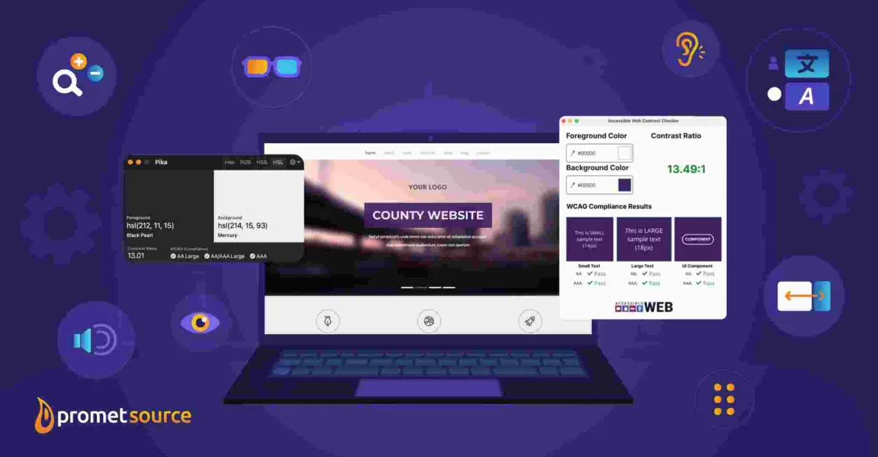
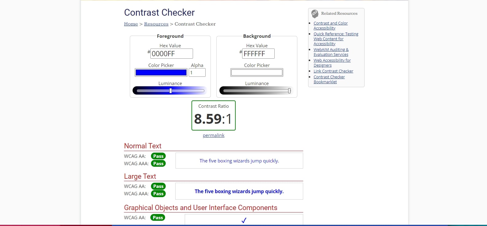
Contrast ratings of 4.5:1 for normal text are adequate for adherence to WCAG 2.2 AA standards.
The WebAIM Contrast Checker is the key tool for ensuring contrast compliance. This tool allows you to calibrate adequate contrast, enter foreground and background colors, or adjust text size to achieve the right ratio.

There are often red flags that help in detecting contrast issues, but it’s always advisable to leverage automated accessibility testing tools to verify compliance or detect inadequate contrast.
Limitations of Automated Accessibility Testing Tools
It’s important to keep in mind, especially when checking a site for color contrast, that automated tools have limitations.
For example, the contrast checker might automatically indicate that white text on a photographic image is non-compliant. It might not pick up on a box shadow, however, or other text design elements that make the text legible and accessible.
Automated tools are still incredibly useful when doing quick checks of your website's accessibility, so this is not to discourage you from using them. To help you choose what kind of automated accessibility tool could be useful to you, I recently reviewed seven popular automated web accessibility testing tools and reported on my findings.

2. Missing alt text
Alternative or alt text enables blind people who rely on screen readers to understand the context and meaning of images on a web page. As the latest stats from the CDC reveal that 6 million Americans have vision loss and 1 million are blind, missing alt texts stand to impede accessibility for significant portions of the population.
You can enter a brief image description when entering alt text, and that might be enough. But, a better and the one we recommend is to focus on users of screen readers with empathy. The descriptions should help them to visualize the image in the context of the page.
CMS platforms such as Drupal require the inclusion of alt text as part of the process of posting images, although images such as Facebook icons, arrows in a slideshow, or icons that are used for JavaScript often manage to slip through without alt text.
We had a webinar with DubBot on navigating web accessibility, and it does a deep dive into why the top accessibility issues are a problem. I suggest you read the blog and watch the webinar recording.
3. Buttons missing text alternative
I found examples of buttons missing any ARIA label to describe what button the link is for. If a button submits a form or helps navigate the site but lacks accessible text, screen readers will not be able to effectively direct the user.
ARIA (Accessible Rich Internet Applications) refers to the addition of semantic meaning to web content for users who rely on screen readers and other assistive technology.
4. Form fields missing labels
In a few cases, I found that the forms – whether search forms, contact forms, or newsletter sign-ups – were missing labels.
They had a form and an input, but the input lacked any ARIA information and did not have an actual label in the DOM either. As such, it was not a descriptive field that was able to provide directions to the screen reader.
If a form requires users to add their name and email address, but the form labels fail to indicate which information goes into which box, users relying on a screen reader will be at a loss when attempting to fill out the form.
Web forms, or any place where users are asked to type in content, often prove to be an accessibility pitfall. When web forms are custom-designed, the likelihood of accessibility barriers is compounded. One solution is Drupal’s Webform module, which helps to ensure accessibility when building web forms.
5. Duplicate IDs
Duplicate IDs can impede the accessibility of labels, form fields, or table header cells by being skipped by screen readers.
By using the same ID in multiple spots, screen readers cannot differentiate the elements from one another, causing them to jump around between headings or between tables.
Duplicate IDs are also a problem if you ever need to link to an item since it will be difficult to distinguish the correct item among the same IDs.
Ensure your website remains compliant with the latest accessibility standards
There’s little doubt that officials and administrators from counties of every size want their websites to be accessible and inclusive to citizens of all abilities. Aside from the ADA being part of our legal responsibilities as website owners, it's just the right thing to do.
It’s also apparent that accessibility non-compliance slips in as websites are edited and expanded upon.
Small oversights can result in significant barriers to users who rely on assistive technology. The solution is regular site audits or reviews for purposes of finding and fixing instances of inaccessibility.
Several automated accessibility testing tools can help in this process. Accessibility maintenance and monitoring is also an essential aspect of a Promet web support relationship.
Interested in knowing that your site is accessible and inclusive for all of your citizens and that it’s on track to remain so? We can help.
Other Insights & Resources you may like
Get our newsletter
Get weekly Drupal and AI technology advancement news, pro tips, ideas, insights, and more.


