2023 Trends in Web Design for Government Sites

Takeaway: Government websites are needing to do more heavy lifting than ever before, serving as a digital hub for announcements, alerts, administrative tasks, events, and general information. Expectations are extending far beyond that of a functional powerhouse. Constituents count on their website to emphasize all that is appealing and unique about their county, or region, or municipality—in a manner that’s engaging and easy to navigate.
Public sector stakeholders recognize the link between good government and strong web presence. Their focus is now on designing sites that advance big-picture goals, improve program effectiveness, and bring communities together. This is why for websites, it's not just the design itself that matters, but also the kind of platform the site is on.
As the Director of UI/UX for an open source web development company with a purpose and passion for igniting new digital possibilities for public sector websites, I’m on the front lines of conversations with government clients concerning must-haves, nice-to-haves, and everything in between for their websites.
I’m also at the other end of the conversation as a close observer and frequent recipient of best government website design awards.
Here’s what I’ve observed lately to be the top trends for government website designs that stand up to the full slate of stakeholder and constituent expectations.
Clearly defined navigation that organizes content for a wide range of constituent personas
Given the depth and breadth of content that often needs to be organized and accommodated on government sites, modern design practices such as proper use of white space along with a spacious and fresh feel that mitigates against clutter and confusion are key.
An open and inviting home page serves as an engaging launch pad for a wide range of user journeys.
Navigation built around user journeys to simplify access to information
Once the key persona groups who visit the site are defined, and the user journeys are mapped, the essential focus needs to be on streamlining and simplifying the UX design, with a focus on removing any potential or perceived roadblocks for users.
Our people-first design philosophy recognizes that State and local government websites serve a broad spectrum of users, and follows a design imperative of defining end-user needs, goals, motivations, and pain points as an essential first step in building and designing a site.
Among the key indicators of human-centered design is increasingly friendly and highly contextual navigational language that provide a walk-through to specific tasks. For example, rather than a "Forms" tab, or a list of departments on the top navigation menu, we recently built a top navigation bar with a tab that read: "I want to," followed by a a sub menu of the following options:
- Apply for
- Pay for
- Register
- Report
- View
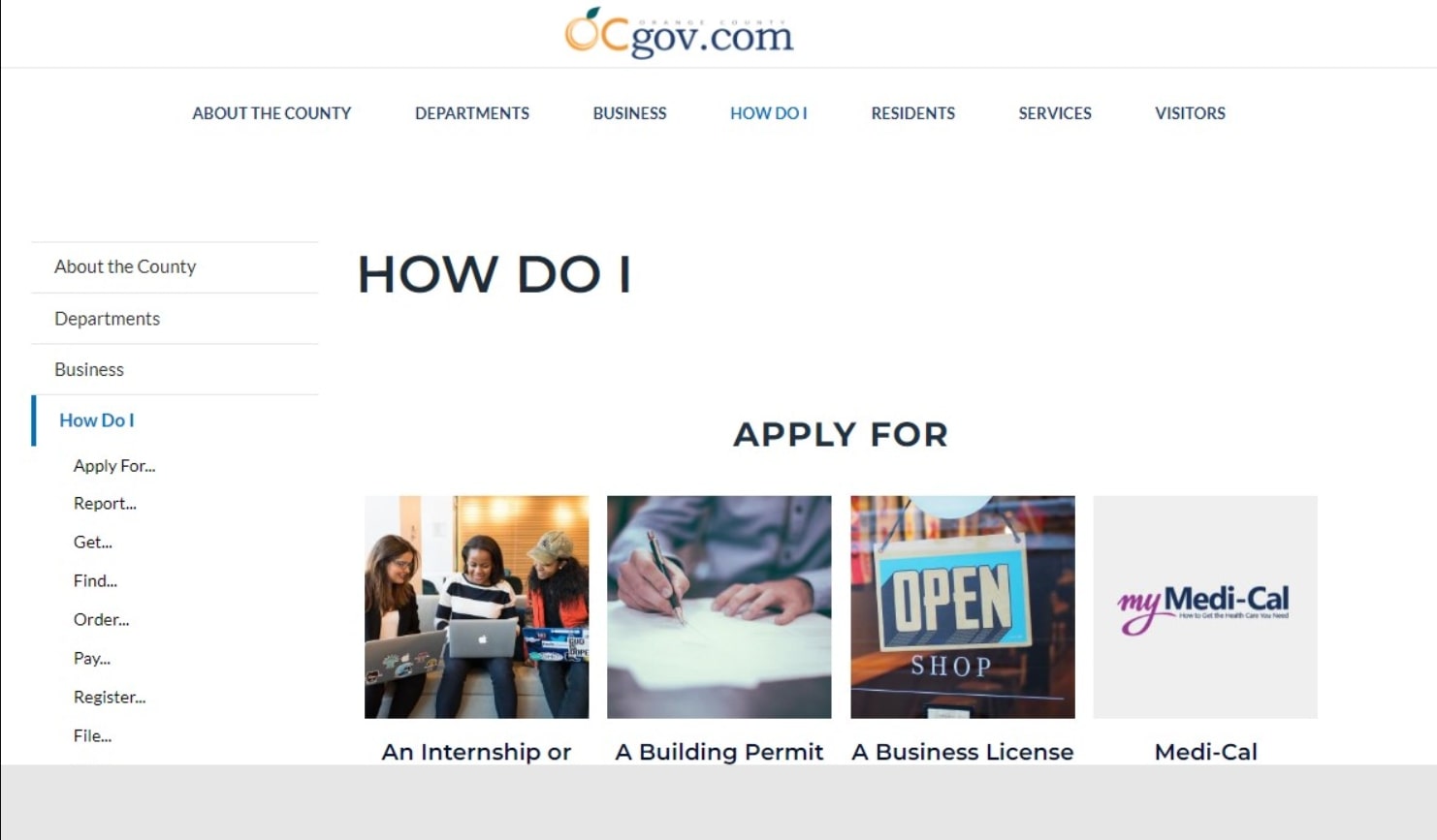 Navigation menus on the Orange County. Calif., website take a similar approach with a depth of options under "How Do I" that serve to streamline user journeys.
Components enable full leverage of imagery displaying the local landscape and top attractions
Beyond information gathering and essential task-related factors, State and local government websites need to reflect the county or municipality in its very best light.
Just as citizens have high expectations that the grounds and interior of their city hall, county courthouse, or State capital will be well tended and impressive, expectations are high for a modern, usable, beautifully designed website that reinforces civic pride.
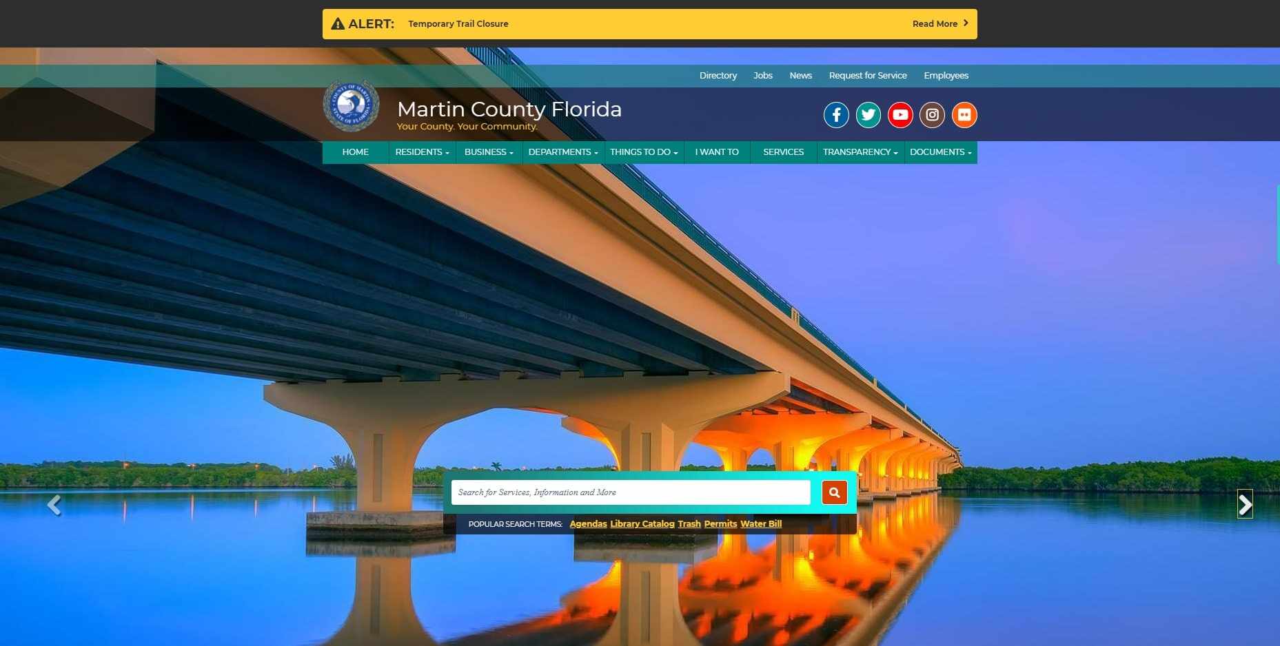
The Martin County Florida website features images on home page that highlight the area's spectacular beauty and attractions for both residents and tourists.
An approach to WCAG 2.2 that incorporates both compliance and inclusivity
Guidelines are important, but web accessibility is no longer being approached from the narrow perspective of just compliance.
The best government websites take a strategic and empathetic approach to accessibility, based on a conviction that inclusive design presents an opportunity to unite communities within a digital platform.
This means, among other things, government websites need to be easy and value-added for everyone to use, along with language and imagery that recognizes diversity.
Flexible content management capabilities that facilitate easy updates, layout changes, and page creation within the prescribed brand guidelines
At the heart of excellent design and UX for State and local government websites is a content management system that enables easy updates and possibilities for pivoting, as needed.
Weather alerts or public health emergencies can emerge with little warning, and while the need for disaster communications is not likely to occur on any sort of regular basis, event schedules are often subject to change and community calendars constantly need to be updated.
For government websites to maintain credibility as a single source of truth, site managers and content editors need to be able to make updates on the fly.
Another factor fueling the importance of a simplified and robust content editor: the opportunity for continuous improvements and citizen-centric enhancements based on community feedback and ongoing intelligence gathering.
Prominent showcasing of local events
As the digital town square, government websites are rapidly evolving into a replacement for newsletters, flyers, handouts, and bulletin board announcements—with an added function of promoting interest, participation, and community.
Prominent showcasing of events also functions as an opportunity to continuously switch up content and inject new life into a site that might otherwise be dominated by static information and transactional needs.
State and government local leaders are increasingly aware that every positive web interaction represents an opportunity to serve citizens and fuel vast new possibilities for connection and operational efficiencies.
Partnering with the public sector to create next-level web experiences that address the full spectrum of citizen needs and expectations is what we do at Promet Source. Interested in what we can do for you? Let’s talk!
Other Insights & Resources you may like


Get our newsletter
Get weekly Drupal and AI technology advancement news, pro tips, ideas, insights, and more.