Table of Contents
Takeaway: Ensuring WCAG 2.1 compliance is not just a legal necessity—it's a strategic opportunity to create inclusive, accessible, and highly usable websites. By understanding and implementing the core WCAG principles (Perceivable, Operable, Understandable, and Robust), public-sector organizations can significantly enhance user experience, avoid legal risks, and demonstrate meaningful commitment to digital inclusion.
GET AN ACCESSIBILITY CONSULTATION WITH OUR SPECIALISTS
Conversations about web accessibility too often miss the bigger picture and the paramount importance of broadening our perspectives for the digital age.
For this reason, it’s extremely important to understand—before getting into the weeds of compliance—that there are multiple facets of digital accessibility.
Standard expectations, such as images with alternative text for those who are visually impaired or video captioning for those who are hearing impaired, account for only a small segment of what’s involved in making a site accessible.
In fact, accommodations for cognitive disabilities and relatively common conditions represent a huge component of accessibility compliance.
Disabilities covered by WCAG can be permanent, temporary, or situational.
Digital accessibility is all-encompassing, for all people, of all ages, and benefits everyone.
WCAG 2.1 overview
WCAG stands for Web Content Accessibility Guidelines. These are international standards developed to ensure websites and digital content are accessible to all users, including people with disabilities. WCAG 2.1 builds upon previous versions, addressing modern accessibility challenges across various devices and interaction methods.
Is WCAG a legal requirement?
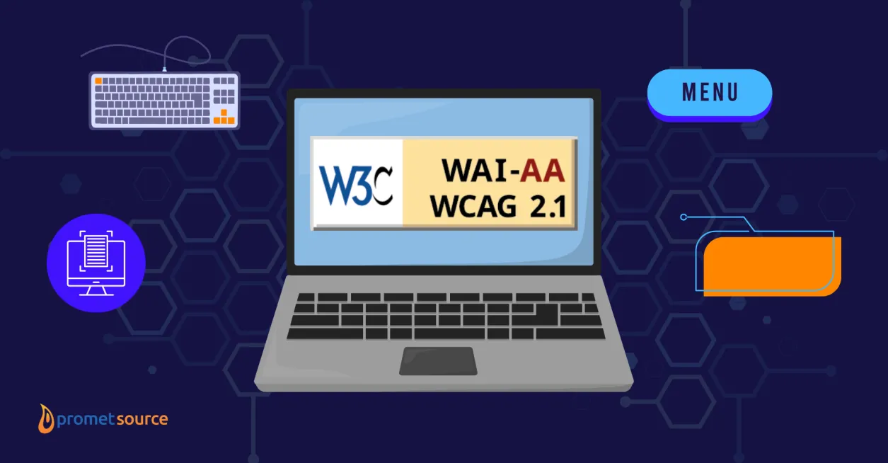
WCAG 2.1 Level AA has been explicitly designated as the technical standard that state and local governments must follow under Title II of the Americans with Disabilities Act (ADA) for web content and mobile apps, as clarified by the Department of Justice (DOJ). This rule emphasizes that adherence to WCAG guidelines is not just advisable but legally required to ensure accessibility for individuals with disabilities.
Section 35.200 requires that public entities’ web content and mobile apps conform to WCAG 2.1 Level AA unless compliance would result in a fundamental alteration or undue financial and administrative burdens.
—Technical Standard— WCAG 2.1 Level AA, "Nondiscrimination on the Basis of Disability; Accessibility of Web Information and Services of State and Local Government Entities," Department of Justice.
A closer look at WCAG 2.1 principles
WCAG 2.1 encompasses 13 guidelines (and 78 success criteria) and is built upon the following four principles:
- Perceivable
- Operable
- Understandable
- Robust
Below, we'll dive deeper into each of these principles and explore practical examples of how to achieve WCAG 2.1 compliance.
1. Perceivable
Information and user interface components must be presented to users in ways they can perceive.
For example:
- Alternative text: All images and non-text content should have descriptive alt text. For example, if there's an image of a government building, alt text might read, "Front facade of City Hall, daytime view."
- Captions and transcripts: Videos must include accurate captions. Provide text transcripts for audio content, ensuring accessibility for hearing-impaired users.
- Color contrast: Text must have sufficient contrast against backgrounds. WCAG 2.1 guidelines recommend at least a 4.5:1 contrast ratio for normal text.
2. Operable
Websites should be fully usable through various inputs, especially keyboard navigation and assistive technologies.
For example:
- Keyboard navigation: All website functions should be accessible using a keyboard alone. For instance, users should easily navigate menus, forms, and links without a mouse.
- Clear focus indicators: Interactive elements must visibly indicate when they receive keyboard focus, enhancing navigation for keyboard-only users.
- Time limits: Users should have the ability to extend or disable time limits on interactive content, such as forms or animation, providing equitable access for users who may need more time.
3. Understandable
Information and the operation of the user interface must be understandable and logical to the user.
For example:
- Logical heading hierarchy: Structure web pages using sequential headings (H1, H2, H3), clearly defining the content flow. Avoid jumping from an H2 directly to an H4.
- Descriptive link text: Use descriptive links rather than generic terms. Replace “Click here” with more informative phrases like "Download the Accessibility Audit Template."
- Standard menu: Website menus should be the same across different pages, so the user can expect to have access to the same options whether they're on the homepage or on a permit request page.
4. Robust
Content must be robust enough that it can be interpreted by a wide variety of user agents, including assistive technologies.
For example:
- Semantic HTML: Proper use of HTML tags ensures content is accessible across different assistive technologies. For example, use
<button>tags for buttons instead of styled<div>or<span>elements. - Compatibility with Assistive Technologies: Regularly test your website using screen readers like NVDA or VoiceOver to ensure all elements are read correctly.
This is the shortest of all the principles, with only three success criteria under it.
WCAG conformance levels
Some of the WCAG 2.1 guidelines are specific to a particular issue, others are all-encompassing. However, the most distinct difference among the guidelines concerns the level of importance that has been assigned to them.
WCAG 2.1 defines three levels of compliance:
- Level A (minimum level): Basic accessibility features. There are 30 criteria under this.
- Level AA (standard level): Meets most legal requirements and is the common standard required by laws and policies. There are 20 additional criteria here.
- Level AAA (highest level): Most rigorous criteria that provide an optimal level of accessibility but may not be achievable for all content. There are 28 criteria under this level.
For a website or application to be considered in conformance, it must meet all 30 Level A and all 20 Level AA criteria.
The remaining 28 Level AAA criteria are considered helpful but not essential for accessibility conformance.
This is largely due to the depth of development complexity required, and in some cases, the potential workarounds to achieve the same objective.
A slow compliance climb for state & local government websites
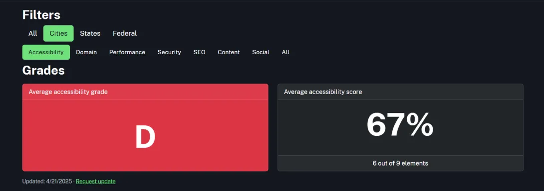
Despite clear guidelines and available accessibility audit expertise, state & local government websites have been slow to step up and demonstrate a commitment to digital inclusivity.
Upon checking Project ScanGov, you'll see that the average accessibility score of US cities as of April 21, 2025, is 67%, while states have an average accessibility score of 75%.
State & local governments face significant legal and ethical responsibilities in ensuring equal access to public services. Compliance with WCAG 2.1 guidelines helps these agencies avoid costly lawsuits, penalties, and reputational damage while providing equitable digital services to all citizens.
Achieve WCAG 2.1 compliance with Promet Source
WCAG compliance isn't a one-time project—it’s an ongoing commitment. Keep your website accessible by regularly updating your skills and conducting frequent reviews:
- Schedule regular audits.
- Provide staff training and clear accessibility guidelines.
- Continuously integrate feedback from diverse user groups.
Promet Source offers deep expertise in WCAG 2.1 compliance, providing comprehensive audits, actionable remediation strategies, and ongoing support to ensure continuous accessibility.
Our specialists, certified by the International Association of Accessibility Professionals (IAAP) and the Department of Homeland Security (DHS), guide public-sector entities in seamlessly aligning their digital properties with legal requirements and accessibility best practices

As an Account Manager at Promet Source, Ashley advises clients in the State, Local, and Education sectors. As an IAAP-certified CPACC, she contributes to digital accessibility discussions and supports the A11yTalks marketing team.


Get our newsletter
Get weekly Drupal and AI technology advancement news, pro tips, ideas, insights, and more.